How To Set Up Your Headings For Google
Let's talk about something that sounds boring but is secretly one of the easiest SEO wins to do for your website:
your headings.
If you've ever built a page and just picked h1, h2, h3 based on "what size do I want this text to be," sit down because we're about to change your life.
Instead of thinking of headings as font options, you have to realize that headings are actually there to create an outline. And Google, along with screen readers, reads that outline to figure out what your page is actually about.
Good news: once you get the logic, you'll never do it wrong again. Let's get into it!
The TL,DR
- One h1 per page, at the very top, no exceptions!
- Headings should be a summary if someone reads only them
- Stay sequential. Use H1, h2, h3, h4, in order
- Eyebrows only get a heading tag if they carry real meaning
- Grouped content (values, FAQs, team bios) get matching heading levels
- Fix how something looks with CSS, never by choosing the wrong heading tag
Why One H1 Per Page Is Non-Negotiable
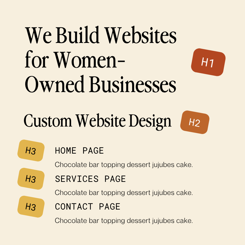
Your h1 title should live at the very top of your content, and it should tell Google (and your site visitor) exactly what this page is about in one clear sentence.
Think of your h1 as the cover of a magazine. There's only one headline on the cover and it's usually the biggest title. Everything else, the smaller cover lines, paragraphs, and little teasers, comes after and supports it. If you've got three h1s on a page, Google doesn't know which one is actually the topic, and that confusion can hurt your page rankings.
One page, one h1, top of the page. That's the rule. Tattoo it somewhere (metaphorically of course, we are not responsible for any actual heading-related tattoos) 🤪
Headings Should Read Like a Table of Contents
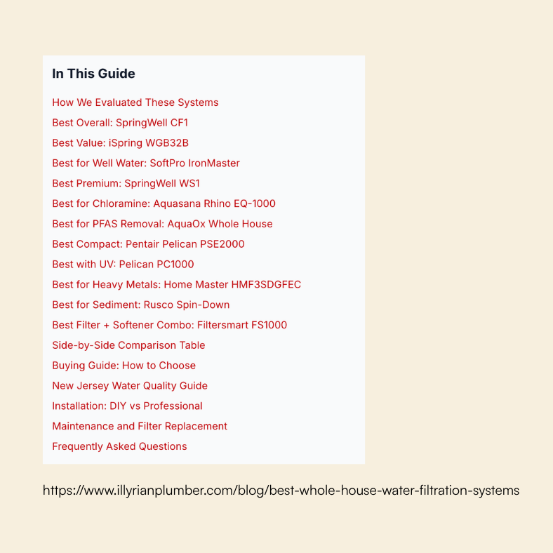
Here's a fun trick: pull up any page on your site and read only the headings, top to bottom, ignoring all the body text in between.
Does it make sense? Could a stranger understand what your article or page is about just from that skeleton?
That's the test. Your headings should work like a magazine's table of contents. Someone should be able to skim just those lines and walk away knowing your outline. If your headings are vague ("More Info," "Details," "Section 2"), you're wasting free SEO real estate and making your page harder to skim.
Do your best to make every heading actually be part of the story.
Keep It Sequential
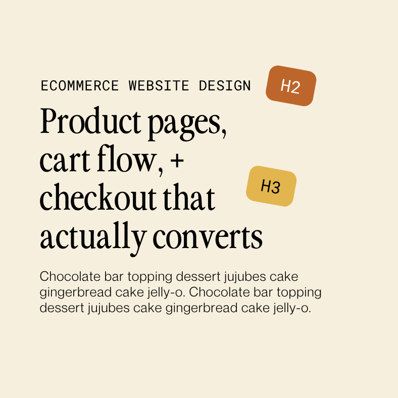
This is the one most people mess up: use h1 → h2 → h3 → h4, in order, every time. No jumping from an h2 straight to an h4 because the h4 font size looked better for that specific text or section.
If a smaller heading style is what you want visually, that's doable through CSS. On a platform like Squarespace though, heading styles are set site wide meaning one font size per heading level is applied everywhere. That keeps your site feeling cohesive, but it does limit how much variation you can get within a single heading level.
So if you need something that looks like an h3 but the content actually calls for an h2.. you've got two options:
- Style your h2 to look smaller site wide or
- Keep the h2 tag, but use custom CSS to make just that one section have the font sizing of an h3
Moral of the story: don't slap the wrong tag on some text just because you want it to look a certain way! You'll end up breaking the outline for Google and make it harder for anyone using a screen reader to navigate your page by headings.
The "Eyebrow" Problem (This One's Sneaky)
Ok, this is the part that trips almost everyone up (ourselves included!). You know that little line of text that sits above a big bold headline? In design, that's called an "eyebrow" or sometimes referred to as a "subheading". We get asked all the time:
does that text get its own heading tag or not?
Here's the actual rule:
an eyebrow
only earns a heading tag if it's helpful to the outline. If it's just decoration or a greeting, it should be labeled as a paragraph/body text instead.
Let's look at two examples:
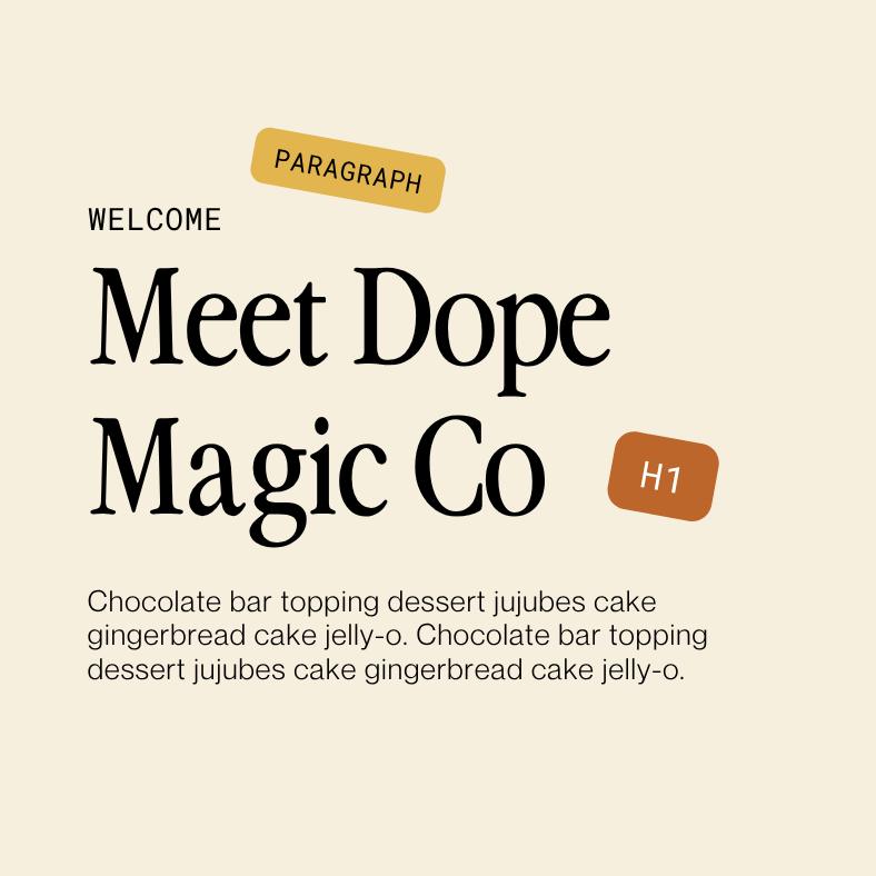
Example 1:
Welcome
Meet Dope Magic Co
"Welcome" doesn't tell anyone anything because it's a greeting, not a topic. If someone skimmed only your headings, "Welcome" adds zero information. So this one is labeled a plain paragraph, styled however you want with CSS, while "Meet Dope Magic Co" carries the actual heading tag. This would most likely be an h1 since this is the kind of line that opens an About page.
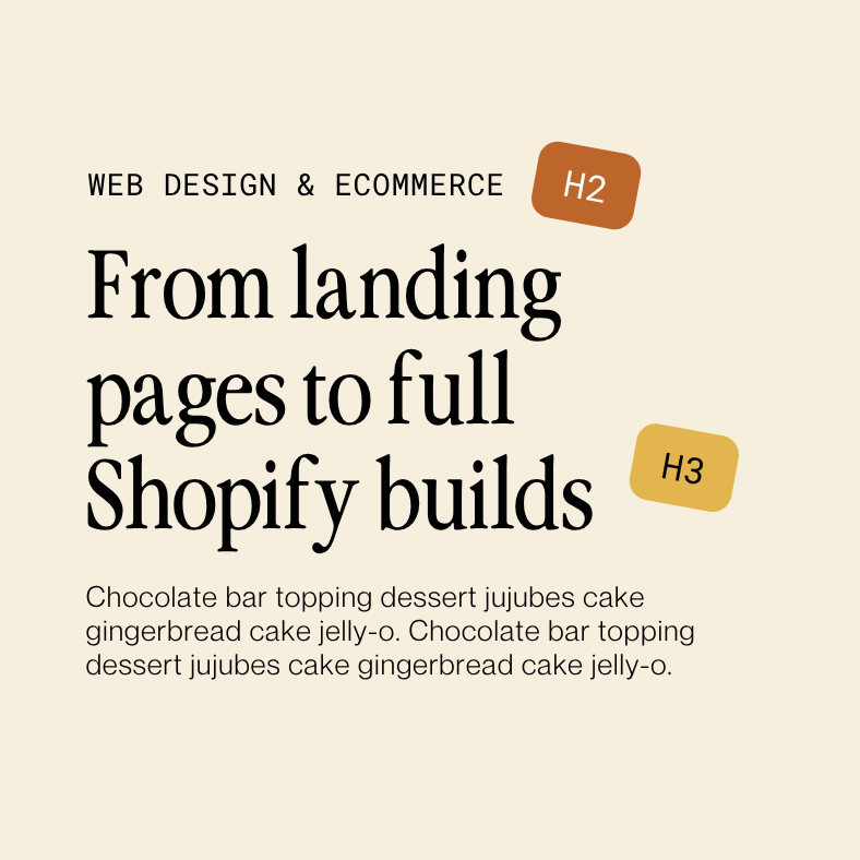
Example 2:
Web Design & Ecommerce
From landing pages to full Shopify builds
Here, "Web Design & Ecommerce" is your h2 because it names the section topic. But unlike a catchy tagline, "From landing pages to full Shopify builds" actually adds new, specific information by telling website visitors exactly what kinds of work fall under that topic. If you didn't have it, you'd be missing helpful information.
In summary, if you covered up your eyebrow text, would the reader lose any real information about what the section covers? If yes, it earns a heading. If no, just label it as a paragraph.
Grouped Content Stays At The Same Level
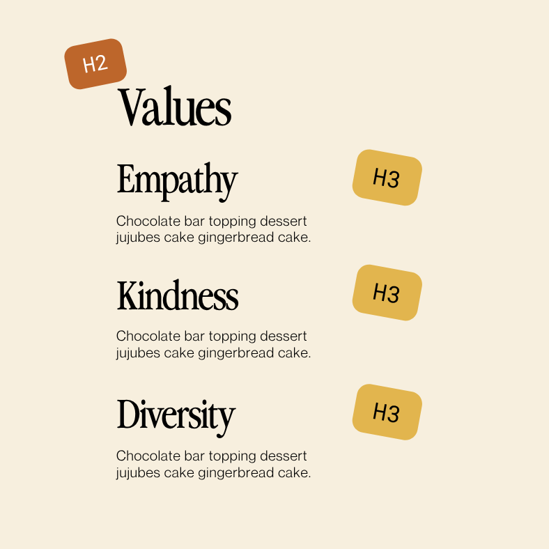
If you've got a group of equal, parallel items, their headings should all live at the same level.
Say you've got a "Values" section (h2) and underneath it you're listing Empathy, Kindness, and Diversity, each with its own little blurb underneath. Those three values should all be h3s not h3, then h4, then h3 again. They're in a collective group, so they get collective headings.
Same logic applies to FAQs. Your FAQ section title is typically an h2. And each individual question, whether it's inside an accordion or written out as questions and answers, is an h3. Every question is equal in importance to every other question, so they all get the same heading level underneath the section header.
The answers are just paragraphs though, not h4. Is it clicking yet? 👀
A Few Bonus Perks
- Accessibility win: Did you know that one of the easiest ways to make sure your site accessible is through proper heading hierarchy? Users who use screen readers will navigate a website page by jumping from heading to heading, the same way you'd skim a table of contents. Clean heading structure isn't just good for SEO, it makes your site genuinely more usable for all!
- Snippet potential: Want more traffic to your site in 2026? Get your website to pop up in search engine snippets. And how can you do that? Headings. If a heading is phrased close to a question, and the text right underneath answers it clearly, Google/AI will sometimes pull that whole chunk into a featured snippet. Descriptive, specific headings can help you get noticed, vague ones won't!
We hope this blew your mind because it blew ours! Go apply these principles to your own website and if you don't have time or want help with your SEO, get in touch. If you found this post helpful, let us know or share it with a friend 💛
Download the Website Photoshoot Guide
If photos have been the thing holding you back, this free guide walks you through exactly what to capture for a high-converting website.
photofreebie