Luxury Website Design: What Makes a Site Feel Elevated (for Beauty Brands & Medspas)
Let's talk about that feeling. You know the one. You land on a website and before you've read a single word, you just know this brand is the
real deal. You'd happily pay their prices. You might even screenshot it for later.
That's luxury website design, and it's not magic (okay, it's a little magic). It's a stack of intentional choices that add up to a site that feels elevated, polished, and worth every penny.
For beauty brands, estheticians, and medspas, this matters a lot. Your clients are trusting you with their face, their skin, and their confidence. Your website is often the very first impression of your work, and the importance of website design for luxury brands comes down to this: people judge the
quality of your services by the
quality of your site.
So what actually makes a site feel high end? Here's what we look for (and build) at Dope Magic Co.
1. Professional photos and video
If you only take one thing from this post, let it be this:
professional photos and videos are the foundation of luxury website design.
You can have the prettiest layout in the world, but if it's filled with blurry phone pics or the same stock photo of a woman laughing with a cucumber on her eye that 400 other spas are using, it's not going to feel high end.
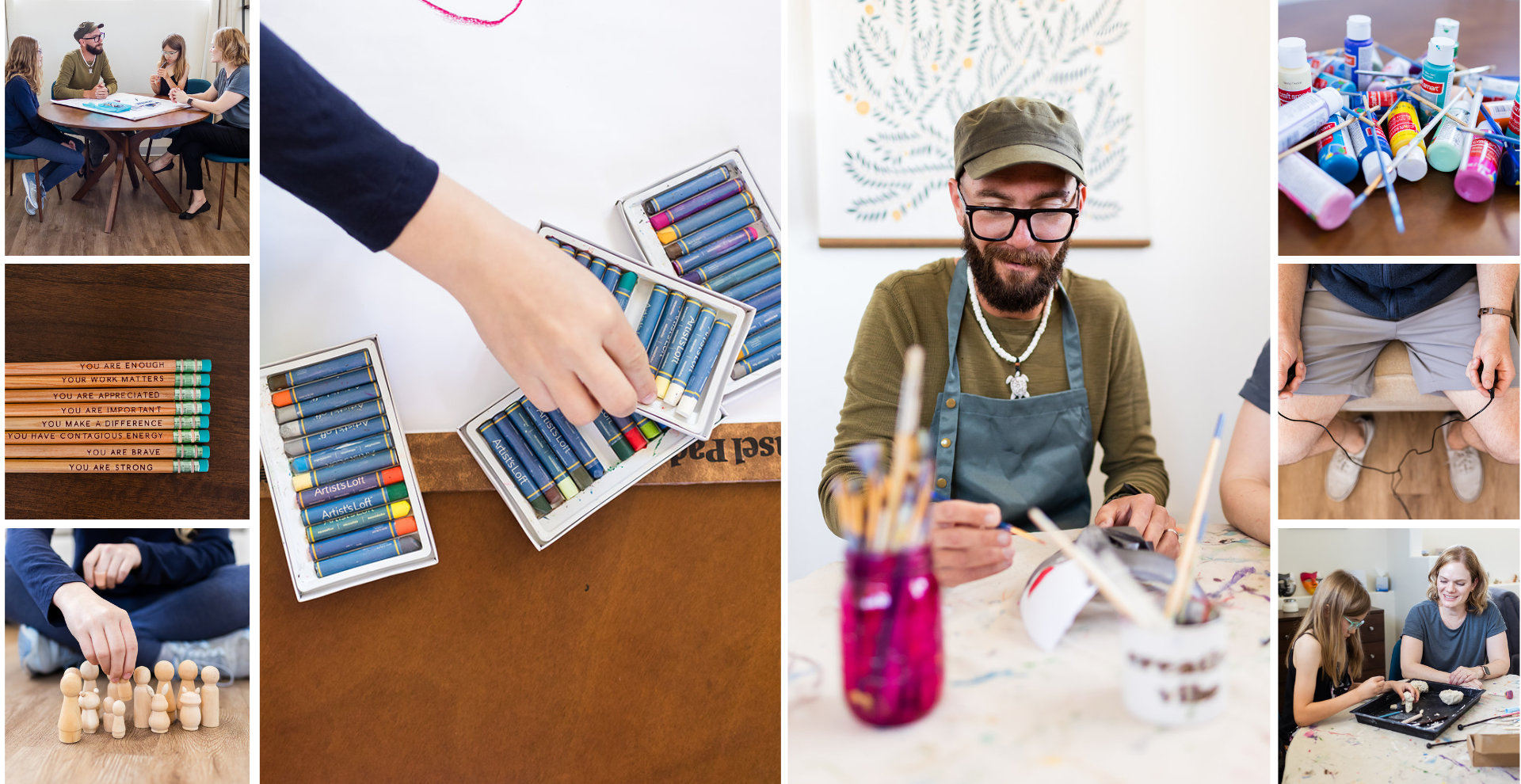
Real photos of your space, your team, your treatments, and your clients do something stock never can. They build trust. They show off the vibe of walking through your door. And they make your brand instantly recognizable.
What to aim for:
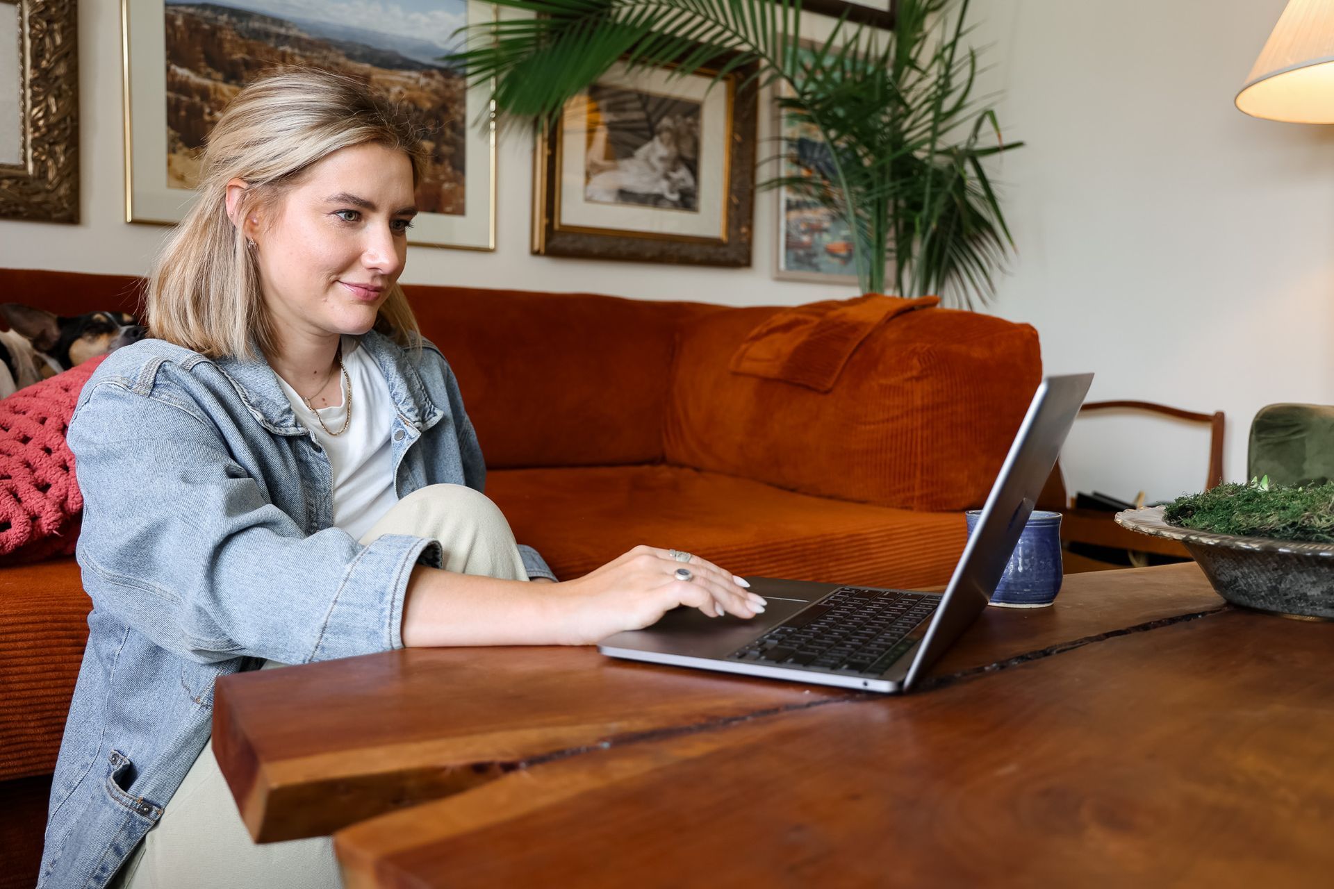
- Brand photos of you and your team that feel warm and approachable
- Detail shots of your treatment rooms, products, tools, and the little touches (that candle, branded masks, coffee station, etc)
- Treatment in action so clients can picture themselves on your table
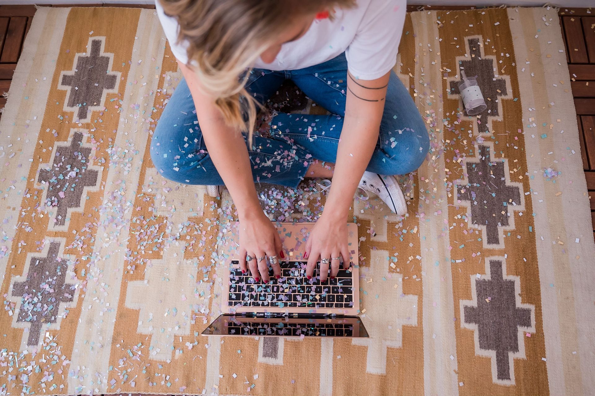
- Short video clips for hero banners, reels, and background loops. Even 5 to 10 seconds of slow motion steam, a serum dropper, or a facial massage adds sooo much richness
Stock isn't evil and sometimes you need it to fill a gap. Just try to use it sparingly, and choose images that match your brand's colors and mood so they blend in. Our favorite stock sites include
Pexels,
Kaboom,
The Vault Stock, and
Unsplash.
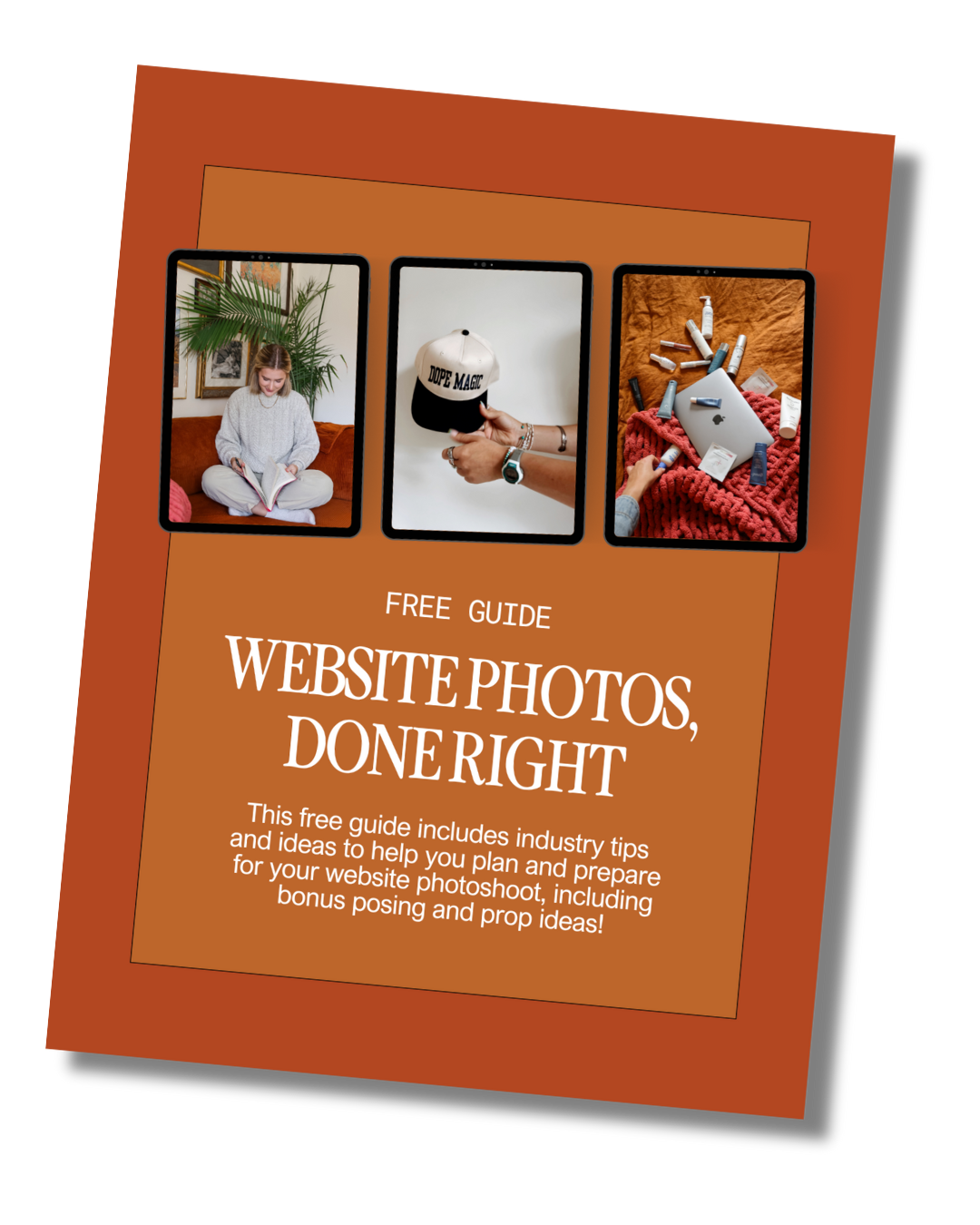
Planning a shoot? Check out
our free guide for a shot list and everything you need to walk away with photos that actually work on your site.
2. Movement makes it feel alive
A static website feels like a brochure. A website with thoughtful movement feels like an experience. It's one of the biggest differences between a template site and a high end luxury website design.
Some of our favorite ways to add motion:
- Marquees: a scrolling ribbon of text (think "book now ✦ glow up ✦ treat yourself") that adds energy and personality
- Scroll animations: sections that fade, slide, or rise into view as you scroll down the page
- Reveal on hover: images that swap, buttons that fill, or extra details that pop up when you mouse over them
- Zoom effects: text or photos that subtly scale in and out as you scroll, giving a cinematic feel
- Rotating icons and badges: a slowly spinning circular badge or star icon is such an easy, chic touch
The key word here is subtle. Luxury movement is smooth and slow, never chaotic. You want visitors to feel like they're gliding through your site, not getting jump scared by flying text. A little goes a long way!
3. A cohesive brand built with intention
Here's the secret behind every great luxury brand website design: it's not a logo and a couple of colors thrown together the night before launch. It's a brand built with intention, where every piece works together. Sometimes you can create that on your own but a lot of times, it helps to have a branding specialist come in to take your brand to that next level.
(Some of our fave branding rockstars:
Kellie Lynn Media,
Karima Creative,
Brightenmade,
Amuse Deisgn Studio, and
Stella Made Creative.)
A cohesive brand looks like:
- A tight font pairing: usually one display font for headlines and one clean font for body text (more on fonts below)
- A palette of 3 to 4 colors: a couple of main colors plus an accent or two, used consistently across the whole site
- Multiple logo versions: a primary logo, a secondary or stacked version, and a little submark or icon for favicons, stickers, and social
- Photos that all go together: similar lighting, editing style, and color tones so your imagery feels like one family
- Consistent design details: the same button style, the same corner shapes, the same spacing from page to page
When all of that lines up, the entire website has a feeling. Visitors might not be able to name it, but they'll feel it. That's what makes a site feel elevated instead of thrown together.
4. Fonts that aren't the same ones everyone uses
Fonts do so much heavy lifting in luxury website design. The same layout can feel bargain bin or boutique depending on the typeface.
The free fonts that come with your website builder are fine, but they're also on millions of other sites. Spending around $20 on a unique font from
Creative Market is one of the easiest, cheapest upgrades you can make. It instantly sets you apart!
A quick crash course on the two main font families:
- Serif fonts have little "feet" or strokes on the ends of the letters. They feel classic, editorial, and timeless. Think fashion magazines and old world elegance. A high contrast serif is a go to for that luxury look.
- Sans serif fonts are clean, without the little strokes. They feel modern, minimal, and easy to read, which makes them perfect for body text, buttons, and navigation.
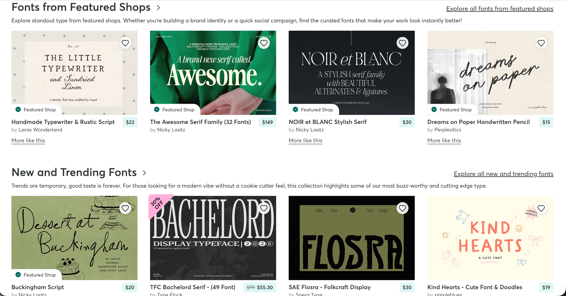
A classic luxe combo is a statement serif for headlines paired with a simple sans serif for everything else. But rules are meant to be broken! A funky display font can feel super high end when the rest of the brand supports it.
Need inspo? Check out our post on our favorite fonts or go get lost on Creative Market for an afternoon.
5. Ecommerce details that feel boutique
If you sell skincare or retail products online, your shop is a huge chance to show off.
A few small SHOP features THAT make a big difference:
- Shoppable images: little dots on a lifestyle photo that you can tap to see and buy the exact product pictured
- Video reviews: real clients talking about their results are more convincing (and more fun) than a wall of star ratings
- Hover states: product images that swap to a second photo, texture swatch, or model shot when you hover
- Background removed product photos: cutting out product backgrounds (or shooting them all on the same backdrop) makes your whole shop look clean and cohesive instead of a mismatched mix of photos. Check out how to easily remove your backgrounds in Shopify.
The goal is for shopping on your site to feel like browsing a curated boutique!
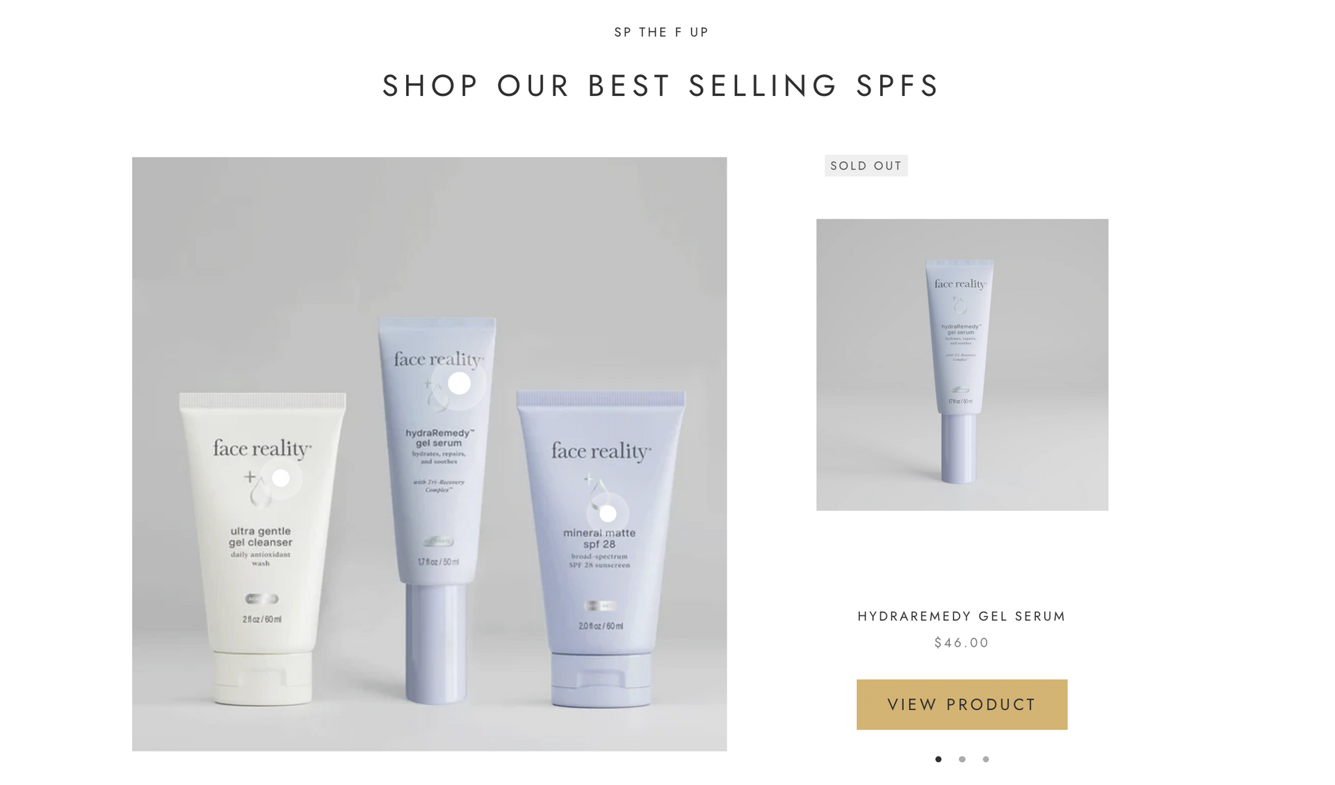
6. A custom cursor
This one is small but mighty. Swapping the default arrow for a custom cursor (a soft circle that follows your mouse, a tiny sparkle, your brand icon, or a dot that grows when you hover over a link) is a detail most people don't expect. It signals that this site was designed with care, down to the tiniest pixel.
7. Home page banner previews
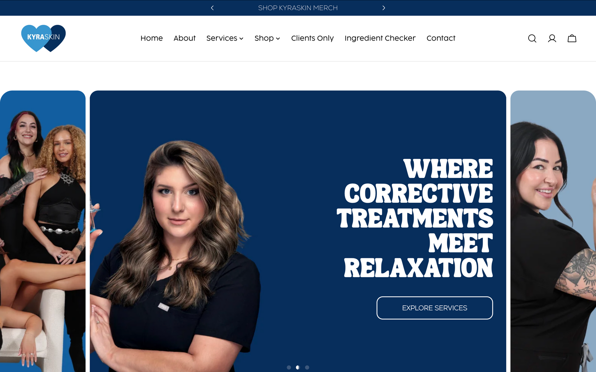
Your home page banner (aka hero section) is prime real estate. If you're using a slider, make it feel intentional with little previews of what's coming next:
- Progress dots that slowly fill up before moving to the next slide, so visitors know there's more to see
- A mini preview in the corner showing a peek of the next slide's image
- Smooth, slow transitions instead of jumpy, fast ones
It's a tiny design upgrade that makes the whole site feel more polished and editorial.
8. Textures for depth and personality
Flat design can feel a little cold. Textures bring warmth, depth, and a real world feel, kind of like holding a beautiful printed brochure.
Textures to try:
- Film grain or noise over photos and backgrounds
- Paper textures like linen, cardstock, or torn edges
- Woven or fabric textures for a soft, cozy feel
- Coffee stains, watercolor washes, or ink splotches for a handmade, artsy vibe
Use them as accents, not everywhere. A grainy background behind one section or a paper texture on your testimonials can be all it takes to give it a little extra oomph!
And FYI: Luxury doesn't have to mean beige (or black and gold)!
Your brand does not have to be neutral, minimal, or black and gold to feel luxury. Those palettes can be gorgeous, but they're not the only way to look high end.
You can have a playful, bold, colorful, totally unexpected brand and still have a site that feels elevated. What makes it luxury isn't the color. It's the intention, the quality of the photos, the polish of the details, and that cohesive feeling we keep talking about.
Here are a few luxury website examples we love that are anything but beige:
- Doll Face Skin Club: An excellent example of using bold and playful textures and colors. Maeci has created an entire world with her brand and it shows throughout her space, Instagram, merchandise, packaging, and online website
- Mainely Skin: Rebekah uses green in her branding which pairs perfectly with her red hair. That coupled with professional photos in a beautiful space.. chefs kiss.
- Strong Esthetics: Dana is excellent at what she does and isn't afraid to stand out, in a good way. Who knew purple could look so good??
- Skin Magic Med Spa: Madi is for the girls and her website and branding show that. She played into the word "magic" in her branding and uses elements like a magic wand in her branding for that thoughtful extra touch.
If you're looking for luxury salon website design inspiration, go click around these. Notice how each one commits fully to its personality, and that commitment is exactly what makes it feel high end!
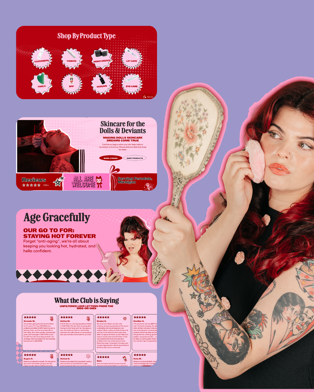
Doll Face Skin Club
Royal Oaks, MI
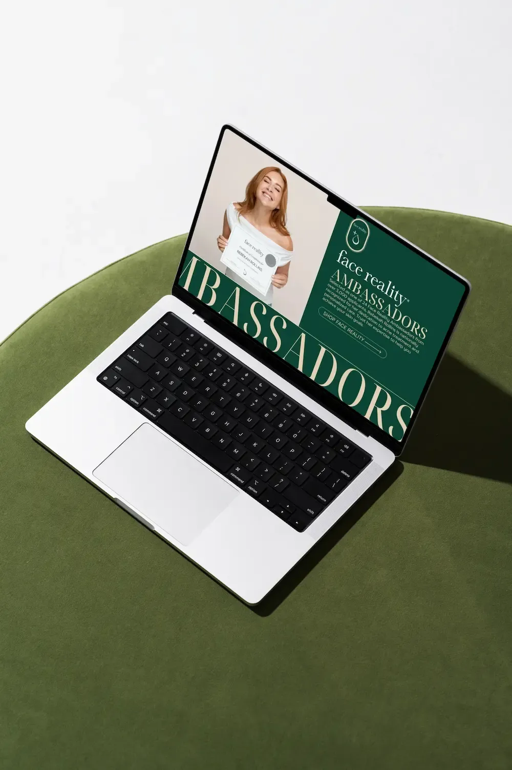
Mainely Skin Care
Windham, Maine
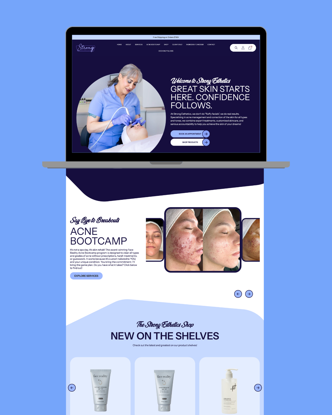
Strong Esthetics
Tinley Park, Illinois
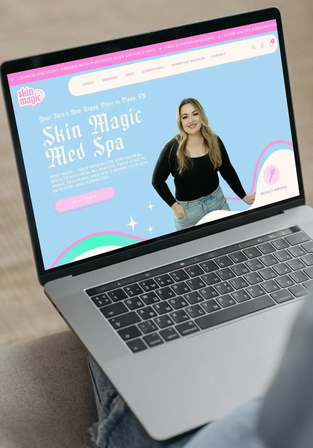
Skin Magic Medspa
Plano, Texas
Ready for a website that feels like your brand?
Luxury website design isn't just about fonts and colors. It's the combo of great photos, movement, a cohesive brand, unique fonts, boutique level shopping, and all the little details. Stack them together and your site stops looking like everyone else's and starts feeling like a million bucks.
At Dope Magic Co, this is what we live for.
We design websites for beauty brands, medspas, and women owned businesses that want to look as good online as their work does in person.
Ready to level up?
Apply to work with us.
Download the Website Photoshoot Guide
If photos have been the thing holding you back, this free guide walks you through exactly what to capture for a high-converting website.
photofreebie